Like many great stories throughout history, it started with a student overdraft. Pre-the 2008 financial crash, they were offering students up to £3,000 interest-free.
Over the next decade I’d enter into a cycle of paying off and recreating debt to combined highs in excess of £10,000.
I am sure many find themselves in far worse positions and there is no denying that earning more has helped finally break the cycle. But it has only been in the last 12 months I’ve really made headway with a little tool borrowed and adapted from the world of the lean startup, and I wish I had discovered it sooner.
Burning down the house
Software developers following ‘Agile’ methodologies will break their work into atomic tasks that can be estimated, in terms of effort, in ‘points’. Someone who loves making graphs will then organise these during ‘sprints’ of around two weeks’ work, and chart how many points are completed each day.
Plotting this over time, you can start to work out how much a team can get done per sprint and give those guys who ask the “when will it be ready?” questions a look at how on (or off) track the team is.
They call this a ‘burn down’ chart and it’s all very interesting and useful for a team.
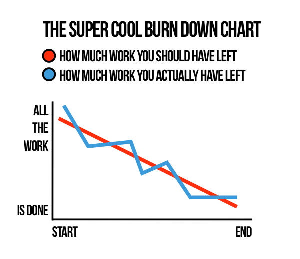
I’m burning up…
In development, having zero work left over is great. When looking at controlling spending, though, I felt ‘burning down’ to zero (i.e.: nothing left to spend) wasn’t a target I wanted to hit. So I turned the chart around to show my spend increasing, to help focus my mind differently.
The main part of my problem with debt is that, over the years, I have made lots of different plans for paying off debt. I’ve worked out my incomings and outgoings, tried to assign budgets and caps but have always found that I never quite stuck to the plan.
I just didn’t keep a track of what I was spending well enough.
So last August, I started entering how much I spent each day into a spreadsheet. I kept the spreadsheet light so I could load it up on my phone and made it so that I only needed to fill in one cell per day, focusing on total spend for that day and not make any judgements around how essential the spending was.
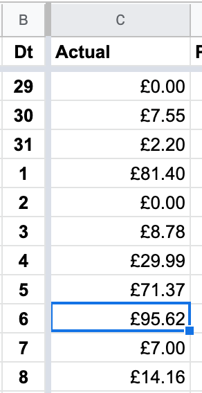
Each month I could also set a budget which would roughly tell me how much I should have spent by that day in the month. To check it worked, I entered the details of the previous month…
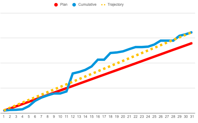
The red line is what I would spend following my plan, the blue line is the running total of how much I actually spent. As I add data, the yellow line changes – working out what I will spend (based on a simple ‘average spent per day’) if I don’t change my ways.
The eagle-eyed among you will notice that in July 2019, I did not do very well at sticking to a plan. I went just over £100 over the plan. If I’d carried that on for 12 months, I’d have added £1,200 to my debt (probably more introducing birthdays, Christmases and other special occasions).
The following two months, however, you will see went much better.
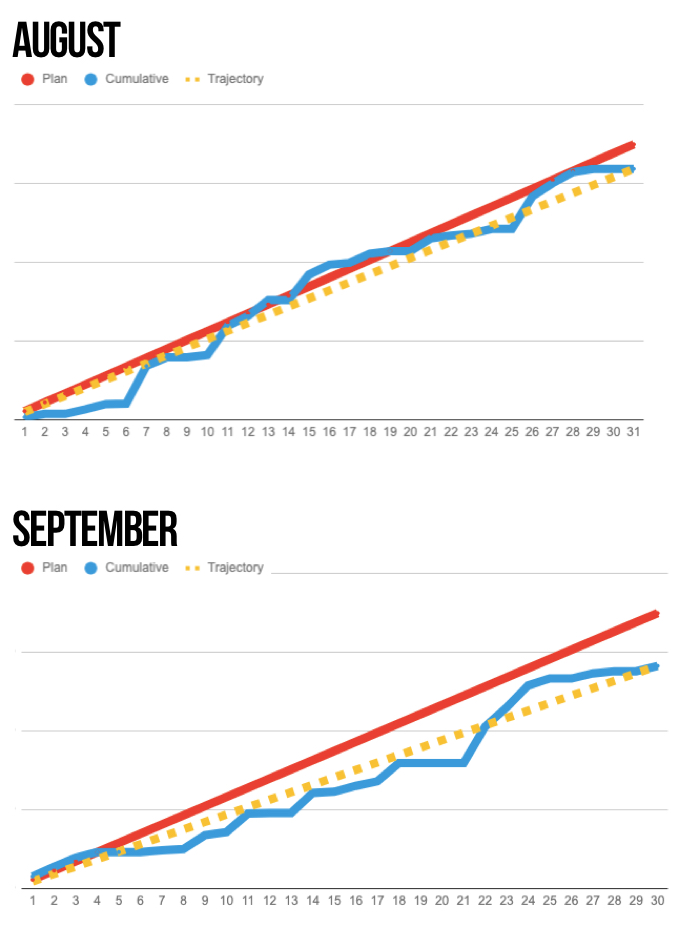
Not every month has been as good as those two, but by making the time to add spending each day, I could quickly see (using the yellow ‘Trajectory’ line) how on- or off-track I was for the rest of the month within seconds.
I could model, almost immediately, the impact of over-spending one day and how long it might take me to get back on track within the month.
In some months, if I knew I was expecting a cost on a certain day, I could add that in advance to plan ahead and make sure to have built in enough slack.
Most importantly, on several occasions it helped me make better decisions in the moment.
But was it worth it?
As with most things in life, it’s difficult to attribute exactly how much of an impact using this tool had on my crawling towards debt-freedom.
But in the 12 months before using it, my debt had decreased by around £1,700 (there’s that cycle again). And I had about £300 in a savings account, unspent.
In the 12 months of using it I have cleared more than £10,000 in debt and have managed to squirrel away the start of my first serious attempt at saving.
Adding all that up, one way or another, the chart has probably generated value of somewhere between £9.5-12.5k.
Knock off the zero cost of the spreadsheet software and the couple of hours work it took to set it up, test it out and tweak it…I think I still win.